Wisely by ADP
Wisely by ADP needed a scalable, cohesive digital ecosystem to support their growing suite of financial products. They asked for a comprehensive digital style guide and flexible UI templates that could adapt across web, social, and video platforms—all while evolving the brand’s identity to feel more modern, inclusive, and accessible.

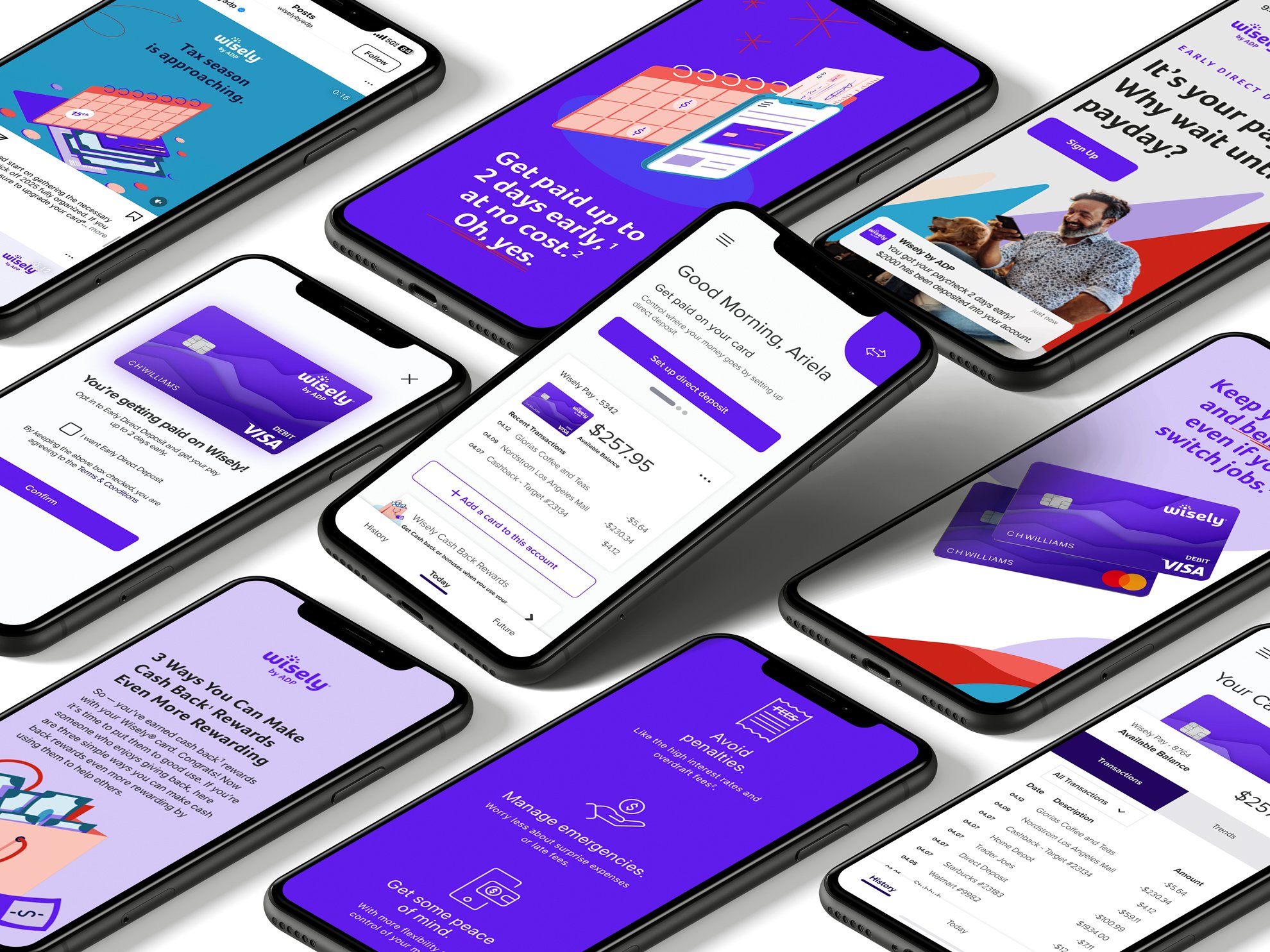
I developed a comprehensive digital style guide and led the creative direction for a full system of custom icons and illustrations. I built flexible UI components and responsive web templates to accommodate a wide range of content, bringing visual consistency across web, social, and pre-roll channels. This work ensured every digital touchpoint felt cohesive, scalable, and aligned with Wisely’s evolving brand identity.


Simplifying financial wellness for businesses and consumers
Insight
Clarifying the relationship between Wisely’s products and features would require solid equity within that brand. So, in order to appeal to both employers and employees, a unifying brand proposition was developed for Wisely by ADP: seamless payment options that build your path to more wins.
This brand proposition would make it clear to consumers that Wisely by ADP would give them more control over their finances and the wherewithal to make the most of their money. It would also make it apparent to employers that the brand would offer a compliant and flexible payment solution that makes it simple for them to pay, empower and reward their people – while leaving paper behind.
A successful activation of this new brand proposition would elevate Wisely as one of three distinct ADP payroll options while earning new equity for ADP as an established leader and category innovator.

Icons
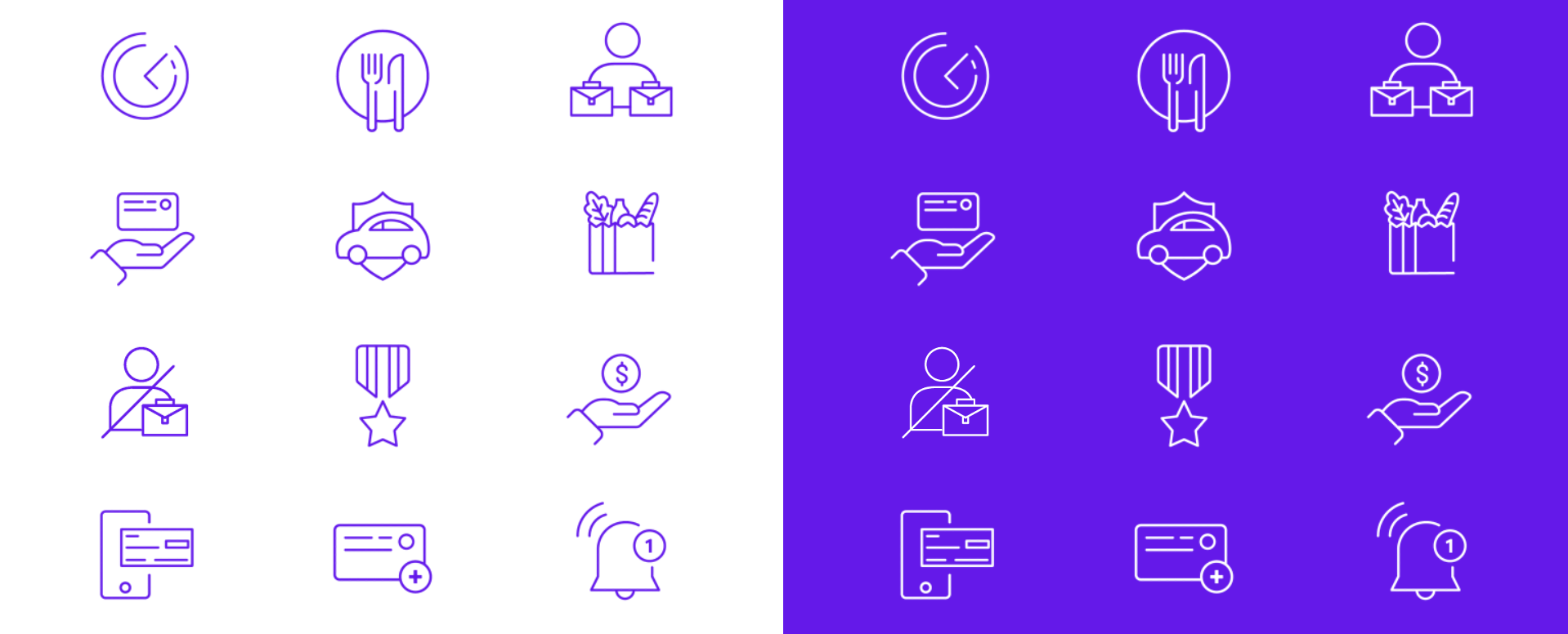
Developed a cohesive set of 50 custom icons for Wisely by ADP, designed to ensure consistency across digital channels. Each icon followed strict design specifications—80x80 sizing, 1px stroke weight, round caps, and inside stroke alignment—to maintain clarity and accessibility. These icons were used across web, mobile, pre-roll, and social, contributing to a unified and scalable brand system.


Illustrations
Designed to explain complex financial tools in a visually engaging way, the system covered topics like savings goals, direct deposit, and spending insights. These illustrations were built to scale across the brand—enhancing not just the web and app, but also social, pre-roll ads, and internal education materials—creating a consistent, modern visual voice.

Deliverables
Brand Positioning
Digital Styleguide
ADA Compliance
Iconography | Illustrations
Experience Design
Social
Year
2022-2023
Role
Creative Director/ Design Lead
Agency
Razorfish
Creative Team
Ashlee Wernimont
Design/Illustrator
Saray Gill
Associate Creative Director
Acknowledgment
This project was a true collaboration with some of my closest, most talented friends—and it wouldn’t have been possible without them.
Careful attention was given to each individual element of the new visual identity, including: Refreshed typography, photography, graphic motifs, and color palette. These elements work seamlessly to reflect the brand's people-first approach.


The refreshed myWisely.com site, myWisely app, social presence and more all reflect an empowering, energized, and pragmatic experience across all our consumer digital touchpoints.

